
MEDA
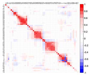
MEDA is an exploratory tool to identify the relationships among variables. A MEDA plot is a color map of size M × M for M the number of variables in the data, where dark colors identify strong positive (red) or negative (blue) relationships among variables. To improve the visualization of MEDA, variables are reordered according to correlation, following a seriation method. Thus, groups of variables can be easily identified.
MEDA can be applied in any subspace of interest, including PCA and PLS, to infer the structure in the data and also to interpret the contribution of each latent variable. It can be seen as a substitute for rotation methods (the basis of Factor Analysis) with better properties associated: it is more accurate than rotation methods in the detection of relationships between pairs of variables, it is robust to the overestimation of the number of PCs and it does not depend on the normalization of the loadings. MEDA also outperforms correlation maps in distinguishing structure from noise.
MEDA is computed as follows. Firstly, a projection model is fitted from the calibration matrix X (and optionally Y). Then, for each variable m, matrix Xm is constructed, which is a N × M matrix full with zeros except in the m-th column where it contains the m-th column of matrix X. Using Xm and the model, the scores are estimated with a missing data method. The known data regression (KDR) method is suggested at this point. From the scores, the original data is reconstructed and the estimation error computed. Each element in the MEDA matrix (i,j) corresponds to the index of goodness of prediction of the reconstruction of one variable (i) from the information of the other (j). Also, thanks to Dr. Arteaga at Universidad Católica de Valencia, Spain, MEDA has a simple analytical expression.
Related references:
meda- Camacho, J., Laurí, D., Lennox, B., Escabias, M., Valderrama, M. Evaluation of smoothing techniques in the run to run optimization of fed-batch processes with u-PLS. Journal of Chemometrics, 2015, 29 (6): 338-348.
- Camacho, J. Missing-data theory in the context of exploratory data analysis. Chemometrics and Intelligent Laboratory Systems, 2010, 103 (1): 8-18. ScienceDirect TOP25 Hottest Articles.